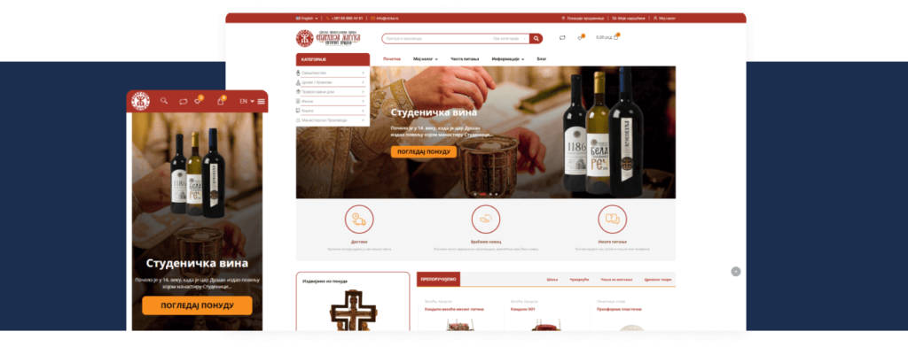
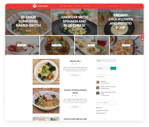
At the beginning of work on the new website of the Diocese of Žička, it was necessary to offer a new design solution. Our designers decided that updating the look of the site should start with adjusting its colors. However, in accordance with the character of the client, we had to fit the colors into a whole that retains the necessary seriousness, combined with hints of a festive atmosphere. We used the old logo of the Diocese as the basis for the (re)design of the site. We extracted the red color (#a93125) from it, which we subsequently used to horizontally define sections on the entire site.
The work on the functionalities of the site was largely focused on designing the blog, because in this case it is necessary that the blog clearly indicates the liturgical cycle in which the church community finds its meaning. Therefore, it was necessary to create a calendar that would allow the visitor to click on a date to access a text that explains the history, meaning and spiritual place of an individual holiday. In the work on the functionalities of the site, the calendar on the blog took a central place. It had to be modeled and integrated into the bilingualism of the Diocese website.
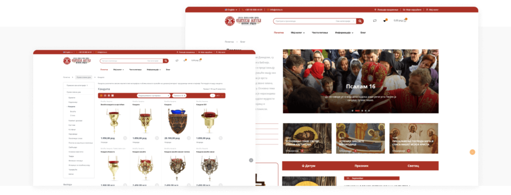
Specially designed category icons were a new challenge in the field of design. It was necessary to graphically present the basic categories of the store concisely and simply, while keeping those icons visible and strikingly presented in the very small space they occupy.
We created appropriate landing pages for each product category, which enabled the client to present their products and their desired categorization adequately and accurately to visitors. Here, too, it was necessary to maintain a strict balance between the character of the client’s work and activities, and the commercial needs that the creation of an online store requires.
That’s why we put sections on the homepage that invite you to buy, which contain beautiful images of church products combined with the religious symbols found on them.
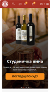
Responsive design was a special challenge because it was necessary to crystallize the design solution found on the desktop. The implementation of those solutions required very precise positioning of the elements that make up the responsive display of the Diocese website.
Our Methodology
Bearing in mind the very specific needs of the client, we have divided the website creation concept into the following steps:
CONTENT WRITING: The client provided us with all the necessary text and photos. Therefore, there was no special work on content creation. However, it is important to note that occasionally the textual content had to be modified for the purpose of creating a design solution, which was the basis of a valid conception of the creation of this site.
DESIGN AND DEVELOPMENT: Given that the client had a very authentic logo, our designers were given the opportunity to use its basic color to horizontally define the header, main menu and elements that, in combination with images and text, call for a purchase. A large part of the site’s pages consists of photos of the client’s products, but when designing the site, great care was taken to emphasize the religious character of the featured products.
SITE OPTIMIZATION: The setting of SEO optimization is carried out in accordance with the needs of the site.
RELEASE OF THE LIVE VERSION AND FINAL COMMENTS: After the release of the final version, we collected comments from the client and gathered all the documentation that accurately shows the complete history of the project.
Results
SUCCESSFUL CREATION OF WORK METHODOLOGY: The methodology we applied when creating the site is a combination of analysis, based on the selection of key design elements, and the implementation of a design solution woven from the mentioned elements, which can roughly be labeled as synthetic. The development of the functionality of the website of the Diocese had to be based on the precise selection of the basic building elements of the website’s visual identity. It was our pleasure to watch how they come together into sections that precisely shape the site’s optimal functionality.
SIMPLE AND EFFECTIVE DESIGN: The website has been (re)designed to offer information about the client’s complete offer, while also emerging from the client’s logo, which is based on a very specific graphic solution. The graphic solution of the site is therefore compatible with the client’s logo, more precisely, the layout of the elements that make up the site is determined by the horizontal division into sections, which is based on the red color found in the logo.
Due to the successful division of the site into sections, navigation is simple, and the display of images from the product gallery is transparent and clear.
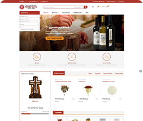
RESPONSIVE SITE: The site is designed as fully responsive, and the graphic solution of the site is consistently presented on devices of different resolutions.
SUCCESSFULLY REALIZED OPTIMIZATION: Our team, by precisely defining SEO parameters and factors, positioned this website highly in the search results.
The results of dedicated and precise work on the website of the Diocese of Žička are most visible in the precise presentation of Orthodox topics and in the unobtrusive presentation of products that a web shop for the Orthodox diocese should contain. Navigation through the site is simple and easy, because it was created by a precise analysis of visual details, combined with their assembly into sections that clearly show church themes and materials.