What Makes A Knockout Landing Page?
The primary goal of any online business is to gain potential customers and clients. But few know how to do it effectively.
How do you persuade your potential customers to buy your products / services or subscribe to your newsletter?
How do you get a random visitor to try your solutions or contact you?
If increasing the traffic on your website is necessary to expose your business to a new audience, then converting the amount of traffic into real customers is its primary goal. Landing pages are just that. They are an effective tool that will engage your visitors and turn them into potential customers and clients.
The page your visitors see after clicking on your ad is the landing page. Inexperienced marketers will direct all traffic to the home page, but they make a huge mistake there. Dedicating special pages to different campaigns and customer types is essential to the success of your marketing strategy.
Let’s see what you need to focus on to create a killer landing page.
What are the advantages of having an optimized landing page?
If a website is necessary for your online presence, a landing page is necessary to save money and avoid losing potential customers. For example, if you put your homepage in your Facebook ads, Google Adwords, newsletter sponsorship, it’s like telling your prospect, “That’s all we’re doing, now it’s up to you to go.”
This is something you should never do, and yet it is very common on the Internet. Many campaigns make the following mistake: the primary purpose of the landing page is not defined. The right landing page should lead the visitor to do one specific, precise and precisely defined thing. Its purpose can be expressed by the following formula:
landing page = goal = what should the client do? = why?
and vice versa.
A good landing page :
- is clear and visible (Internet users decide in less than 3 seconds if they find the information or not on your site … or they leave!)
- directly informs the user about the benefits for him
- contains a simple and immediate call to action
- loads quickly.
The ultimate goal of a landing page is to guide the user towards a specific action.

Tips for creating successful landing pages
Creating a successful landing page takes time and thought. It’s not a complicated job, but in order to create effective landing pages, we have to follow certain rules. Ignoring them usually leads to unsuccessful landing pages. Here are some tips for creating landing pages for your website:
Keep it clear and short
Your offer should be easy to understand. Put your information at the very top of the search. You may find it helpful to make a short video explaining your proposal. When you provide a targeted level of traffic, keep users informed of what they are interested in. Show them the value of your offer. Whether a visitor is looking for information or preparing to get in touch with your company, you need to provide clear and relevant information to improve the visitor experience and retain them as potential customers. Also, if you link the landing page to an ad, it’s best to embed the same message between it and the landing page. For example, if you offer a discount on website design services and your ad says something like, “Click here to save 10% on website design services,” then your landing page must explain how people can take advantage of that offer and save 10%.
Create awesome content
Present outstanding content that vividly tells your story and instills strong confidence. Testimonials and reviews can present content that builds trust and confidence.
No one likes to be a guinea pig of a product or service. People want to see others use something to keep them interested. It is important to know what other people think about the product / service you offer. That is why testimonials and reviews are of key importance for attracting visitors and clients.
Have your clients expressed their satisfaction in writing? If so, put it in the “they trusted us” section.
Do you have clients you already work with? If you have, quote them appropriately and put their logo next to their statements.
Have you already served more than 100 customers? If the answer is yes, state for example: “Our services are used by more than 100 clients…” When the customer sees this, he says to himself: “Wow! They must be great at their job!”

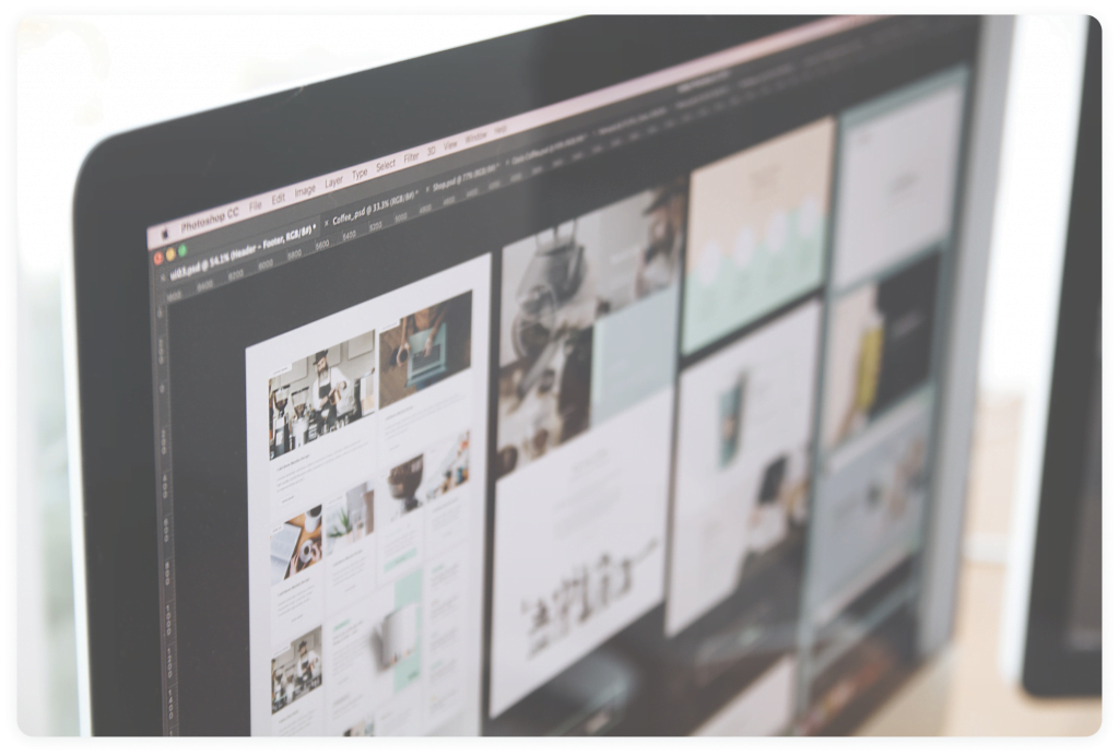
Use Eye-Catching Imagery
Visual elements clearly indicate a commitment to the quality of the website. It takes more time to create pages with appropriate visual elements, but they therefore indicate the level of your engagement and your clear perception of quality.
Highlight benefits and features
Confusing advantages and benefits when defining business goals is a very common mistake. Characteristics represent a particular product, while benefits represent what a product should bring or offer to the user.
On good landing pages, you’ll always see a section that describes what the product does, its interaction with the user, and its basic features. Authors of texts often equate advantages and characteristics, or present them without clearly underlining the differences. That’s wrong. Your product can have 100 functions, but in addition to them, it is necessary to emphasize the advantages of your product. For example, a watch may have a sapphire face as a feature. But the fact that the sapphire is practically impossible to scratch is a real advantage, which may not be obvious if you are not already familiar with the used technology.
Call to action
Calls to action (CTA) are buttons that tell us what to do. As the name suggests, they urge you to take action. But some website design companies are making a serious mistake here: putting small CTA buttons! Your CTA button should be large and obvious, with a prominent color and in a desirable contrast with the environment. As readers read your title and find what is interesting to them, you must clearly point out to them the continuation of their work.
A good call to action should be:
- Visible: A good big button so that it can be seen at 5 meters
- Accurate: Your call to action must explicitly specify what the reader should do
- Convincing and unequivocally profit-oriented. Instead of saying: sign up for our newsletter, say “sign up for our newsletter to receive exclusive offers and insider advice”. It is more concrete and better emphasizes the benefits!
Your call to action must contain active verbs, effective and convincing epithets such as free-exclusive-new. Find other effective expressions here (link).
It is impossible to say which of the powerful words is the most effective because it depends on the character of the product, service or the context in which we want to use it. The best CTA (call to action) is the one that gives you the best conversion rate.
Mastering the basic principles for creating landing pages presented here is essential for attracting potential customers. When your site is online, monitor its performance indicators and test if it can be improved. Only then will you be able to build your online business.